Friday, November 19, 2021

Moments from Around the Seine, Paris and the Danube, Vienna


Sometimes living in the high desert of Arizona makes me miss large bodies of water. And, as a street photographer, over the years two rivers in Europe have provided me with ample opportunity to capture moments that have special meaning because of the historical and contemporary meaning the Seine and the Danube have in Western Europe.

So, on a day when all is dry around me, I looked for a few photos from France and Vienna.


Paris

The photo atop this page was a challenge of film photography. I was using 100 ASA film and the sun had set almost an hour ago. The lens on my Yashica 124 TLR camera has a maximum of 3.5 which is not suited for photography in the dark! But the couple embracing on the public bench and the Tour Eiffel in the back made me try a slow shutter speed of 1/8th second, handheld!

It took a number of attempts to print it in my darkroom, and then when digitally scanning it but gives me a secret view of the crépuscule (twilight) near the Seine.

This next photo, one of my favorites, I took at around sunset with a Mamiya 645 medium format camera. There was enough light for the superb Mamiya Sekor 90mm lens opened wide to 1.9. The texture and the tonal range came out beautifully using an Ilford Delta 100 film.


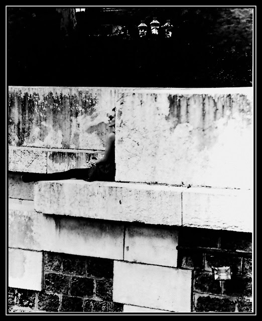
With cropping, The Ilford Pan 50 film gave me a delightful "view" of the wall:


It is all Paris in this photo, made for B&W photography!


Another published favorite is that of two young women on the wall next to the Seine. The Beret and the pigeon (which just flew into the frame…) make this photo immediately recognizable to represent a Parisian moment.


Of course I had to choose a photo taken from a Bateau Mouche or cruise boat to travel the Seine and see Paris from that angle. There was plenty of sunshine that day for my 1969 Nikon F and I took this shot with minimal lens focusing preparation.


Only à Paris…


Vienna

On this trip I wanted to capture the street artistic character of the long walkways on both sides of the Danube. 

While the Blue Danube is the most popular waltz by Johann Strauss II, I feel comfortable saying that the Danube has never been blue in modern times. I have walked the promenade on the shore of the Danube in Vienna many times in the past 50 years, and have never seen that river blue. And the walls around that walkway are not pristine in shape or colour.  And that for me is a character I cherish as a photographer.

So, on this trip I looked for that reality of shape, colour and texture that represents the Danube for me.

This photo is about wall art and street sculpture on the west promenade (the Danube runs at the right of this photo). The sculpted dead tree is a humanoid presence and the paintings on the walls will exist till they are cleaned and replaced by new phantasmagorical paintings.  So, what I captured at that moment does not exist anymore. It is history. Although the paintings are often in vivid spray paint colours, I think the general mood of the walk is best represented in shades of gray.


This second photo is my favorite from that trip as it is a true street photography. Steel, water, sharp edges, an old bridge and a pensive man as if admiring his reflection in the Danube. Or his sorrows. And then, a classically dressed woman showing timeless style amid a historic setting. Finally, in the upper quadrant a man leaving the scene. For me, this is a photo of cosmopolitan life but without crowds rushing along. It is also all texture and Fujifilm Neopan Across film did capture the autumnal early morning on the shores of the Danube.


Finally, I shot from the west promenade capturing the recent times of massive immigration throughout Europe. It is a socio-political statement next to the flowing river. It represents the times and issues that old river has seen more than once, when it was once blue and now that it runs in more subdued colours.


November 19, 2021

© Vahé A. Kazandjian, 2021


Friday, November 5, 2021

Color is Descriptive. Black and White is Interpretative (Eliott Erwitt)


The debate about why B&W photos affect the viewers so differently than color ones has been going on since Scottish physicist James Clerk Maxwell proposed that using red, blue and green filters (RGB in today’s digital world parlance)and superimposing the three images would result in a colour photograph. This was put to test in 1861 by Thomas Sutton, who later invented the single lens reflex camera, by producing a colour photograph of a tartan ribbon using Maxwell’s principle of the three-color analysis and synthesis.

Of course the red, green and blue filters did not produce a colour photograph as we Eastman Kodak’s Kodachrome reversal film did in 1935, but paved the way to the era of photography most of the world takes now for granted. But E. Kodak did not create the colour film—indeed, two French brothers, Auguste and Louis Lumière marketed a colour process in 1907 which was adopted by the silent movie industry as well and called Technicolor. The first Technicolor movie, albeit silent, was “The Gulf Between” which premiered on September 13, 1917.

So the “Wizard of Oz” (1939) was not the first film in color but sure helped Kodachrome become a household name in the 1950s and slowly make B&W photography a niche art form rather than mainstream medium for capturing the moment.

So, where do we stand now?

After digital photography seemed to have put the last nail in the coffin of film, B&W photography is still alive and being resurrected.  Major film and camera manufacturers are producing film again, as well as cameras that have the classic looks and perhaps some of the features.

Why?

Because what B&W photography based on B&W film can produce digital technology has not achieved. At least for artists who continuously explore the suggestive and interpretative magic of shades, tonal ranges and the fluidity of the interaction of these two characteristics that give a movement to the viewer rather than a “still imprint.”

Like many photographer and art critics, I have written about this subject more than once. I still use film, classical mechanical cameras and cherish my work in the darkroom. That is why my favorite most succinct contrasting of colour vs B&W photography is by Eliott Erwitt, the Canadian-American street photographer who has taken most iconic (in my opinion) B&W portraits of famous people, among these being Marilyn Monroe. In his portraits of her, Monroe is the girl next door not the sex symbol we fantasized about from the movies.

                    Color is Descriptive. Black and White is Interpretative 

Of course, descriptive does not mean colour photographs cannot or do not tell a story. They do. But I think that photographers using are more didactic though their emphasis using colour. They tell you what they had in mind. What your eyes should focus on. So, in some way colour has build-in interpretation – that of the photographer.

Black and White being interpretative means to me that there is enough fluidity through the shades of gray to allow the viewer interpret what he/she is seeing based on the life experience and personality of that very viewer.

And perhaps that is why B&W photographs, especially if printed in a square format have that je ne sais quoi many appreciate. Because it makes them part of the interpretation, not just the recipient of the photographer’s work.

To illustrate, I am including two photos. The first, shown at the top of the essay I took in Morocco. I did some burning and clearly dodging to create that moment of social gathering in a street traditional Moroccan character. The man on the right, with his wife next to him gets the attention—they are happy to see me with my Minolta Autocord medium format TLR camera. Yet, the space behind them is obscure and one wonders if it is their small shop or the side of a house. But there is a lock on the steel gate that closes that area. Is that their shop still closed or a garage? Are they selling peppers in the street or mixing business with pleasure socializing with the neighbors?

Perhaps one such neighbor is the woman standing in front of them. We do not see her face, and many do not immediately notice the child she is carrying on her back. Is she his mother or grandmother? Is she buying peppers or just chatting? So we do not know what she looks like; nor do we have a good sense of the environment.  I purposefully included the bicycle as the only “artifact of visual comfort”. Each viewer is left to their interpretation.

The contrast, the shades and shadows in this photo, I believe are best expressed through B&W film.


This next photo is from Baltimore, Maryland. Again the woman’s face is hidden, but the man’s shows a calm moment of respite. We do not see her legs and feet, but we know she is bare foot because of her walking shoes at her side. We assume the man is napping close to her bare feet.  Is he napping though? Or did they disagree during their conversation and opted for personal space? Was his mother-in-law with them on this outing and decided to move away after the argument? We see a female’s feet walking away from her.  But her body language is similar to her daughter’s we see part of at her right. But the proportins seem misleading -- her daughter looks much farther than the plane she and her husband (?) are on. And that gives a delightful depth of field to the photo. Almost three-dimensional.

There is nothing didactic in this photo—I have heard as many interpretations as the number of viewers who have seen this at an exhibit. 

… Perhaps the best description about the popularity of colour film is not in the photos but what it represented in the 1970s. The lyrics of a Paul Simon song entitled “Kodachrome” (1973) puts it this way:


Kodachrome
They give us those nice bright colors
Give us the greens of summers
Makes you think all the world's a sunny day, oh yeah
I got a Nikon camera
I love to take a photograph
So mama, don't take my Kodachrome away


PS/ I find it intriguing that in the Middle Ages there was the “Camera Obscura” (Darkened Room) consisting of a room with a small hole in one wall (today we would call it a "pinhole camera...) It was first used to watch sun eclipses as the image of the sun projected, upside down, on the bleached wall facing the hole and shielded the viewer eyes from the rays.  Then in the 1600s this set up was used for drawing as the upside down projections were traced on a sheet of paper and then coloured in.

Then came the Lumière brothers in the early 1900s with their colour processing of photographs. From Obscura to Lumière (Light in French) the definition of Black and White was created for photography . But the origins of that word are associated with the Camera Obscura as “photography” is derived from the Greek language where photos mean “light” and graphein means “to draw.” Photography, as a word was cornered in the 1830s. 

November 5, 2021

©Vahé A. Kazandjian, 2021